|
It’s no secret in the writing world that one of the most important elements of achieving success is having an eye-catching, professional, and well-designed book cover, and if you’re smart, you’ve probably hired a graphic designer to do this. But did you know that a cover is far from the only way that you can use graphic design to help further your writing career? One of the first ways you can incorporate graphic design into your branding is to design a personal logo. A logo will make you seem professional, and it can help tie all of your branding together. A well-made logo can appear on your website, business cards, letter heads, resumes, job listings, or anything else you might want to put together for yourself. But a poorly designed logo can be more detrimental to you than having no logo at all, so here are some things to consider. 1. First and foremost, know your level of artistic ability. If you are not an artist, do not try to design your logo yourself, at least without a good deal of practice and experimentation. This isn’t to say you can’t learn the skills needed to be a graphic designer or even teach yourself, but you need to approach this with a degree of professionalism. A logo is often the first thing a customer associates with a company, and it can define your brand. So if you don’t want to put in the time and effort to design your logo yourself, hire somebody! 2. Know your image and know what you want to say. A well-designed logo needs to convey the personality of you and your writing. My writing tends to have a dark side, so I used darker toned colors in order to convey that in my own logo. A romance writer might want to use pinks and scarlets while a writer of children’s lit would typically tend to a brighter, more diverse palette. Regardless of the genre, the colors you choose in your logo should say something about your work, and you need to choose your colors deliberately. Overall shape and style is another important factor to consider when choosing your design. The shapes that you use are read to have certain meanings that can subconsciously suggest a certain image to the viewer. In general, curved shapes tend to have emotional meanings, such as community, unity, friendship, and love, while more rigid shapes tend to represent professionalism, balance, practicality, and strength. You also must consider the style of the artwork that you will incorporate, if you incorporate any imagery at all. For instance, I chose very clean and simple images for my logo in order to seem professional and put together. The elements of your image are every bit as important as the quality of your design, and it is very important to put out an accurate representation of yourself. 3. Make sure you have a high-quality image file. A vector-based image file is preferred to a pixel-based image because no matter what size you want to display your image at, it will always maintain the same pristine quality. If you try to blow up pixel image past a certain point, you risk it becoming grainy and pixelated. A great program for vector-based graphics is Adobe Illustrator, but it can get expensive. That being said, if you do have to use a pixel-based image (such as a JPG or PNG), make sure it is the proper resolution. At least 300 DPI is necessary for printing purposes, but a most screens only portray 72 DPI, so that resolution is high enough for web use. However, it is very important that a JPG is not the only file type that you have your image in. JPG files will corrupt over time, as they compress each time they are opened, and this means that you will eventually lose your image completely. There is no point in having a logo that is too poor quality to use. 4. Your first idea probably isn’t your best. Real designers go through pages and pages of iterations in the form of pencil sketches before they even start a finalized project. Sit down and make a list of your ideas. Draw some sketches if that works for you. Let your ideas flow and look at some inspiration images. Trust me, it helps, and you’ll be happier with your final result. 5. Go beyond a logo. Graphic design is limitless. I put together a poster that can be seen on the home page of my website, and it’s a great graphic for putting onto promotional items such as bookmarks and T-shirts. Shirt sales can be a great way to bring in additional revenue, but the design has to be something interesting, eye-catching, and appealing. The key to this step is creativity. Have some fun with it and experiment a little. A great way to do this is a company called Printful, which allows you to create printed products with your own images and runs as a print on demand service, which means there’s no risk to you. Play around with some designs. See what works! A peek at my design process: 1. Inspiration images. Think of some themes or imagery that interest you. Google it. Google logos for your career. Try many different search terms until you find a pool of examples that you like. Then sit down and look at them and decide what elements you want to pull from. But that doesn’t mean that plagiarism is okay. You can use p to 10% of a design without crediting the artist. Above that, you need to rework things beyond being recognizable to the original piece. Here are some of the images that I pulled from:
2. Sketches. They don’t have to be good. They don’t have to be finalized. They don’t have to have details or order. All your really need to worry about is composition and getting your ideas out onto your paper. Here was my sketchbook page: 3. Start working in your final format. Typically, this will be a digital platform, such as Adobe Illustrator. Replicate your favorite sketch. Add color. Decide if you still like it. This was the first digital iteration of my logo (the grid was just the background on my Illustrator workspace): 4. Revamp. Edit. Make all the little changes you want, and feel free to experiment. One of the great things about digital art is that you can copy your design, paste it into a new area, and make all the changes you like. Don’t like it? Go back to the old version. Repeat until you don’t hate it anymore. And voila, you have a finished logo.
1 Comment
Fran Spence
1/13/2019 03:19:33 pm
These blogs are very well written! Leave a Reply. |
CATEGORIES
All
Currently Reading:
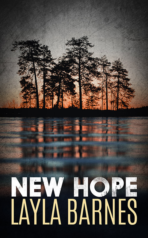
Native Tongue by Suzette Haden Elgin From the Author:

Looking for something I've reviewed?
Visit my Bookshop to help support independent book stores! |


 RSS Feed